NEWSPIXEL
There are widespread concerns over misinformation, fake news, and propaganda found in secondary sources.
NEWPIXEL address this as a well as attack the following questions:
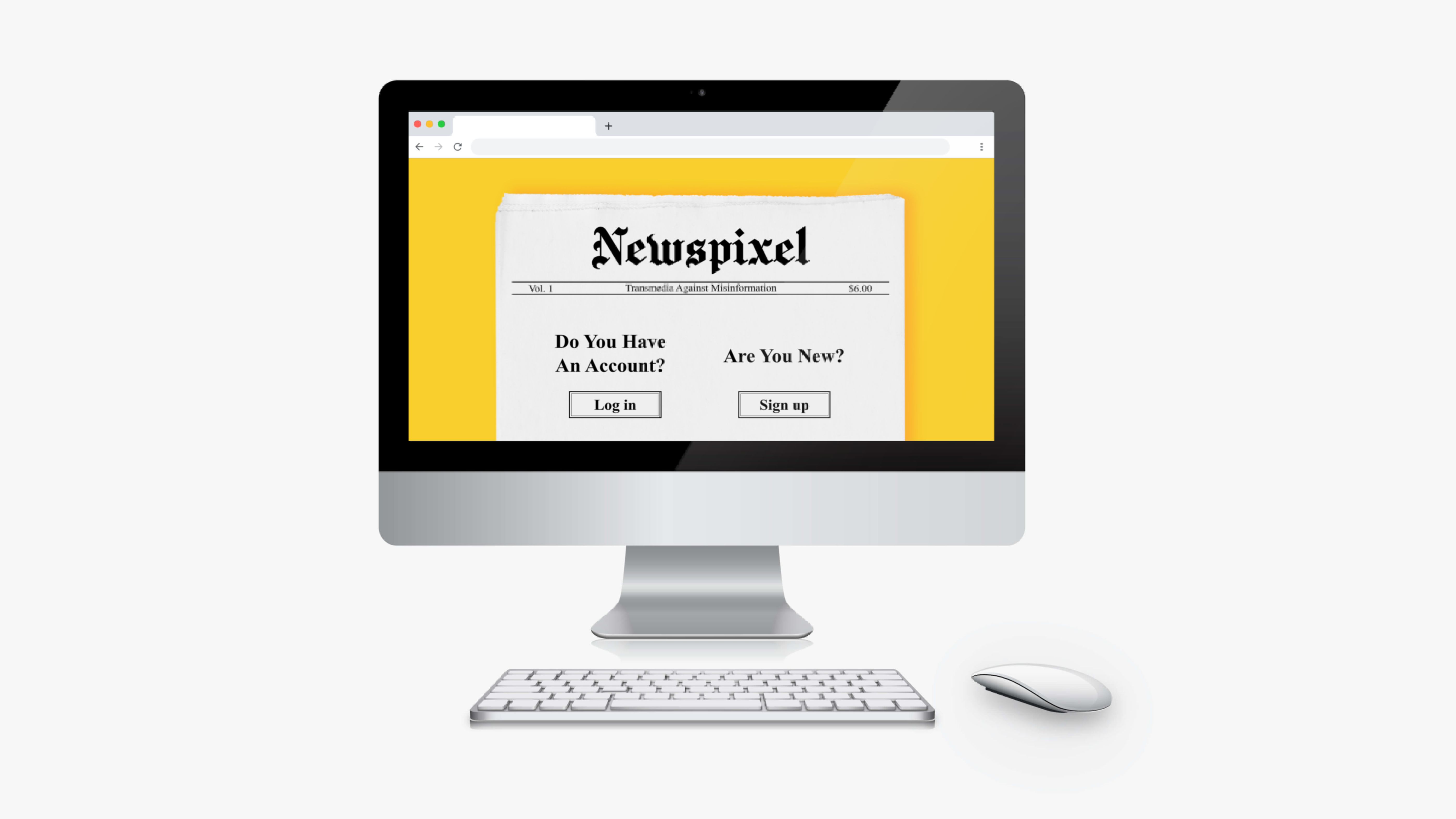
Click ↑ to see the prototype!
There are widespread concerns over misinformation, fake news, and propaganda found in secondary sources.
NEWPIXEL address this as a well as attack the following questions:
Click ↑ to see the prototype!
Programming
UI/UX Concepts
Adobe CCs
Unity
Maya
Programming
Unreal 4
Game Design
Illustrator
Figma
Squarespace
Programming
Photoshop
Vegas
Unity
Audacity
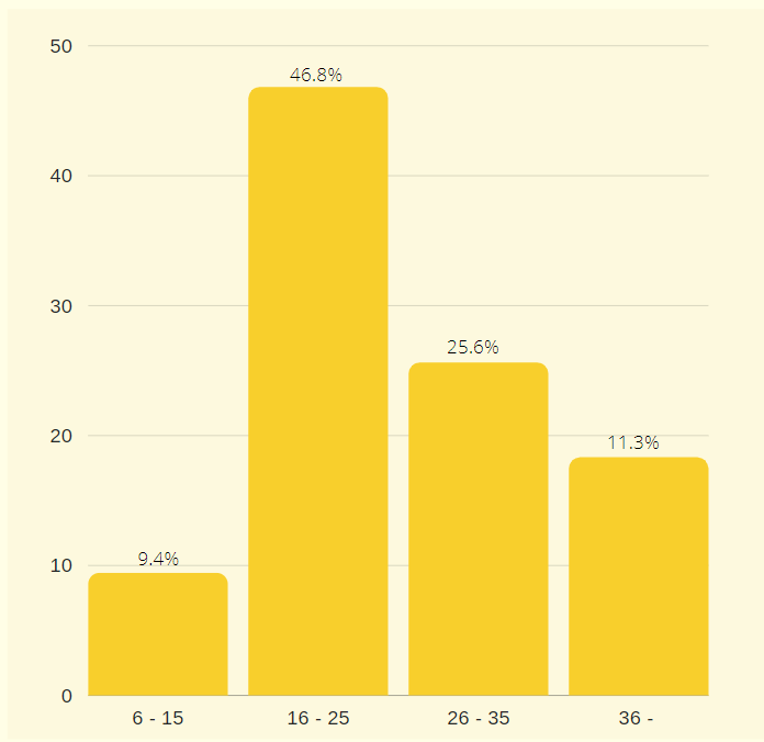
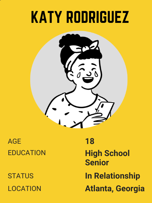
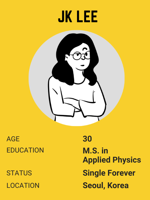
According to research, more than 50% of transmedia users are 16 -35 years old.
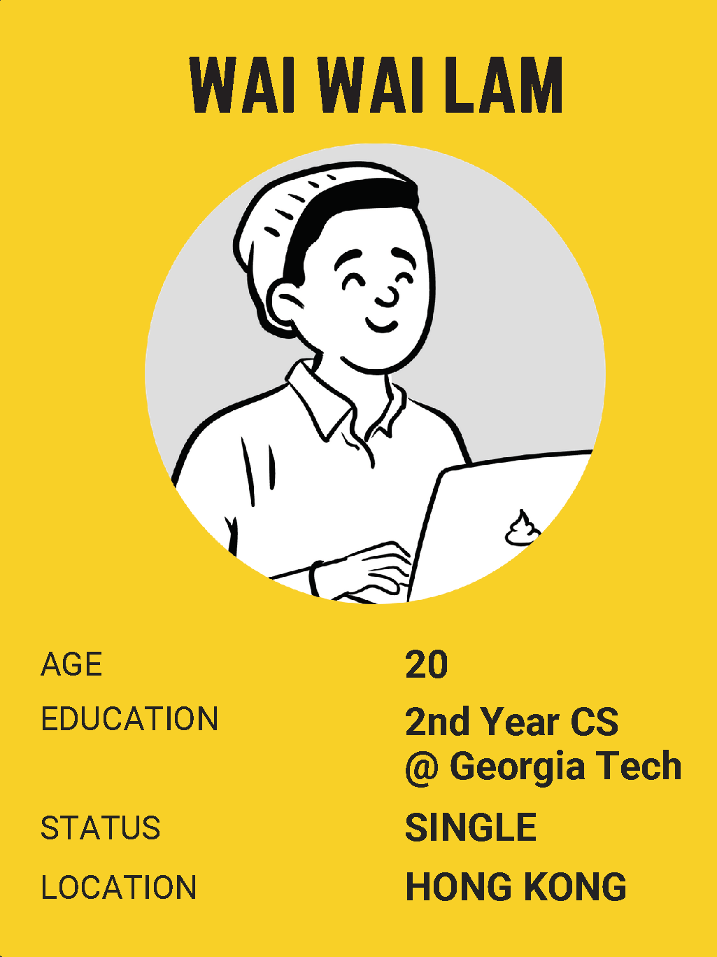
Since we are looking for the problem of misinformation on transmedia, we thought we should focus on the people who use transmedia heavily. So, we decided to set our target user age range from teenagers to mid-30s Most of our users will be high school students and college students.
Since transmedia is accessible anywhere in the world as long as the internet works, we will not specify the location of the users to a certain region.
Our game will be a web-based game, so the users will be able to play it either on PC or their mobile devices.
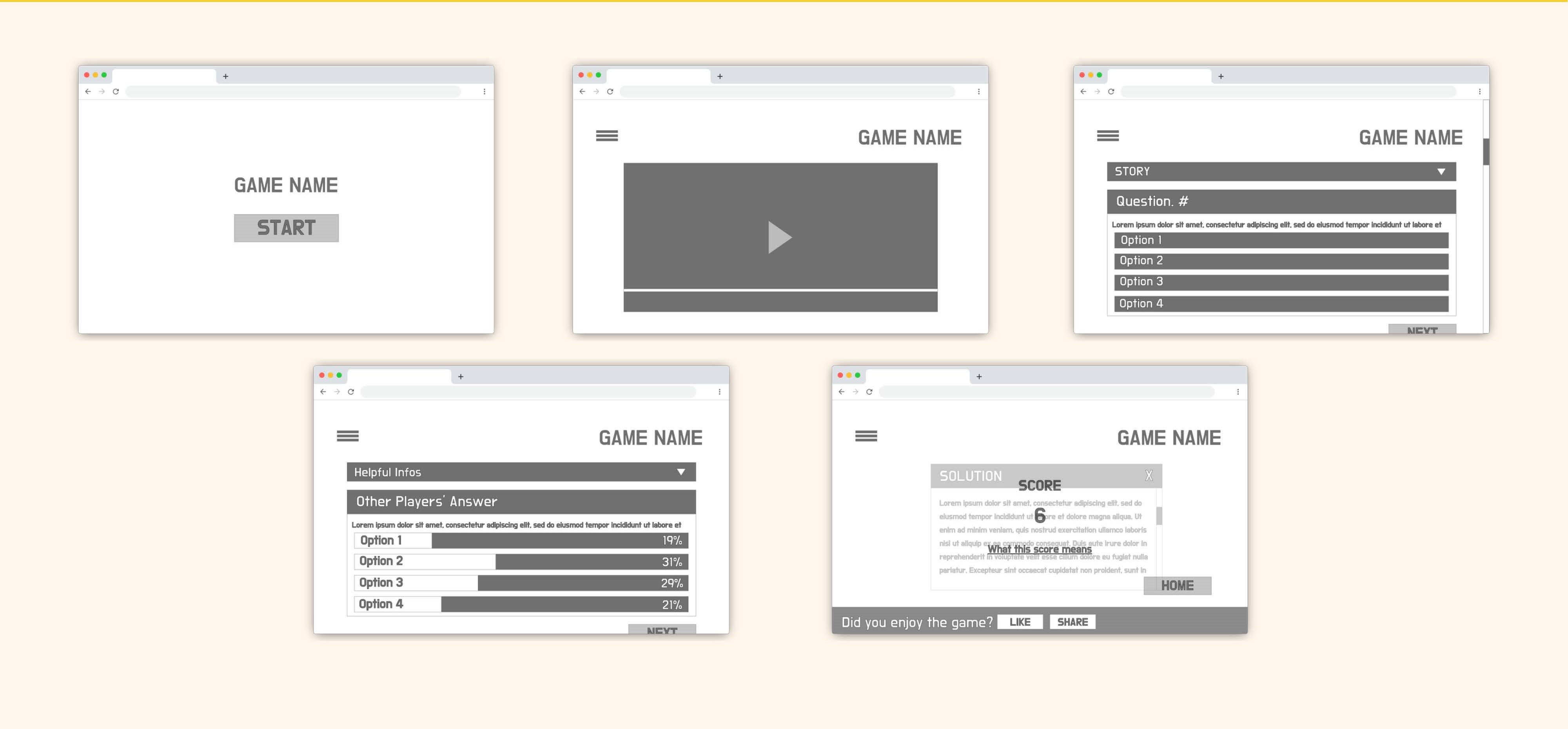
Click the image to see the detail
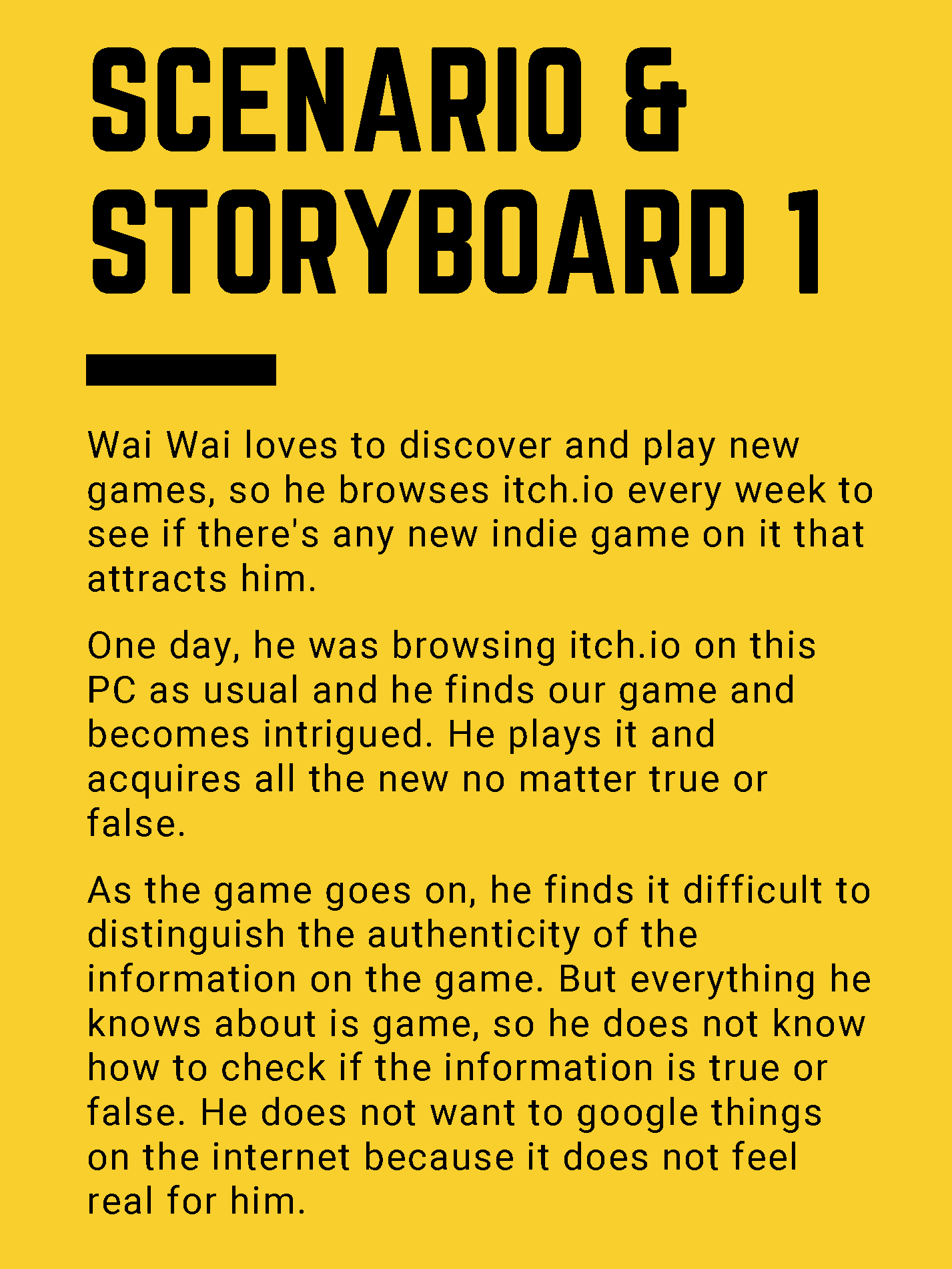
Click the image to see the detail
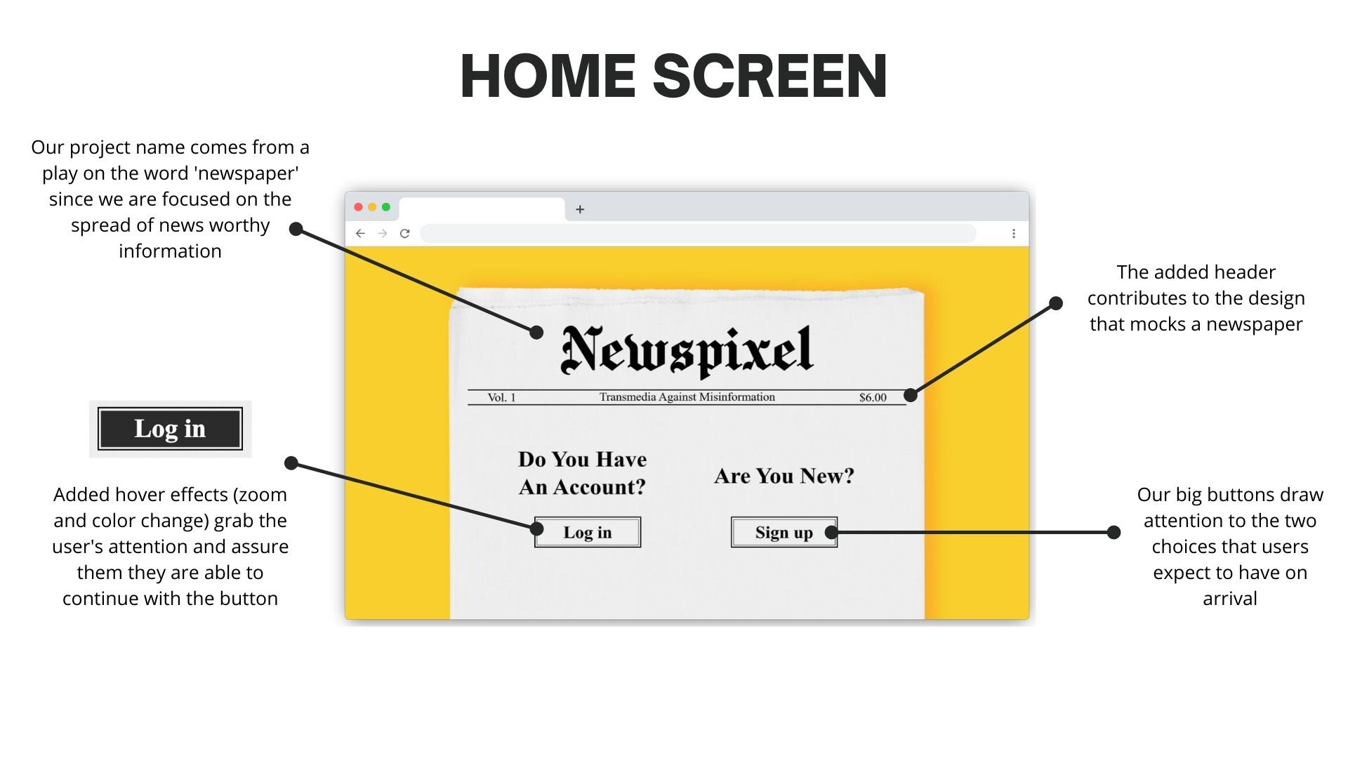
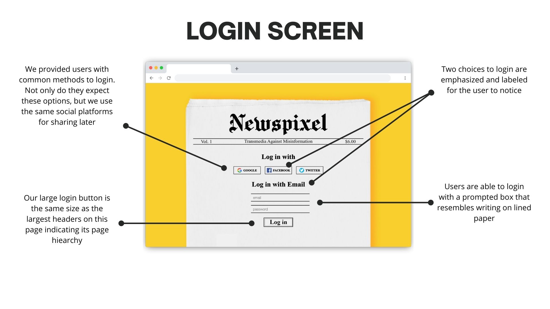
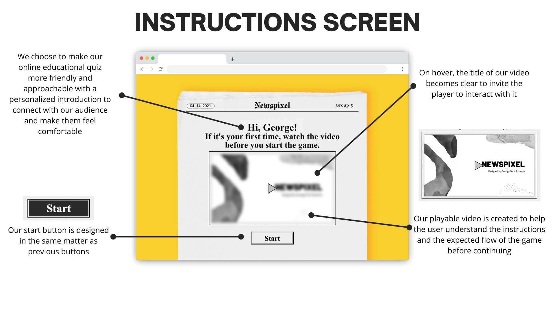
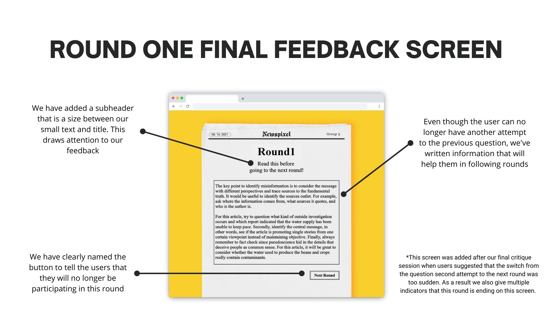
In our brainstorming critique, the main issue that needed to be addressed was the ethical implications of sharing the stories between platforms; additionally, we had to address the fact that we were initially lying to our players about what the game was. The forced us to questions if the game was made for the purpose of fun or for the purpose of research.
After this evaluation, we clarified that our game was meant to be more educational, which was our major change.
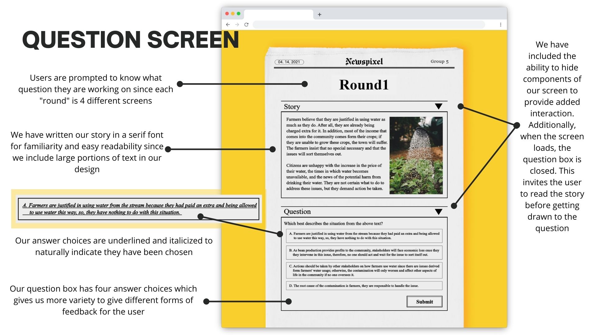
In the second critique of our low-fi prototypes, the big choice we had to make was which prototype of the 5 took all our personas best into account. One of the biggest criticisms here was how detailed the stories and answers were going to be. We experimented between answer choices of true or false, or multiple choice. We addressed this by considering our personas. All three seemed like they wanted toe power to make their own decision and think through what they were reading (one persona loves social advocacy and wants to understand others, one is self-sufficient, and one is skeptical about information). Because our personas enjoy mental stimulation, we decided to keep multiple answers rather than a simple true and false.
Additionally, this was the point where we started needing to address how much text on a single page there would be. Because the amount of text is overwhelming, we have decided to create them in boxes that help the user feel more in control. We accomplished this by creating a text box that you can open and close during the game.
We were able to receive direct feedback from 4 people. Each team member conducted a cognitive walkthrough to understand what our users were thinking.
Click the image to see the detail
Initial reflection thoughts is that we were more attentive to certain parts of the process than others. For example, we spent a lot of time figuring out the direction of our project even as we were working on wireframes.
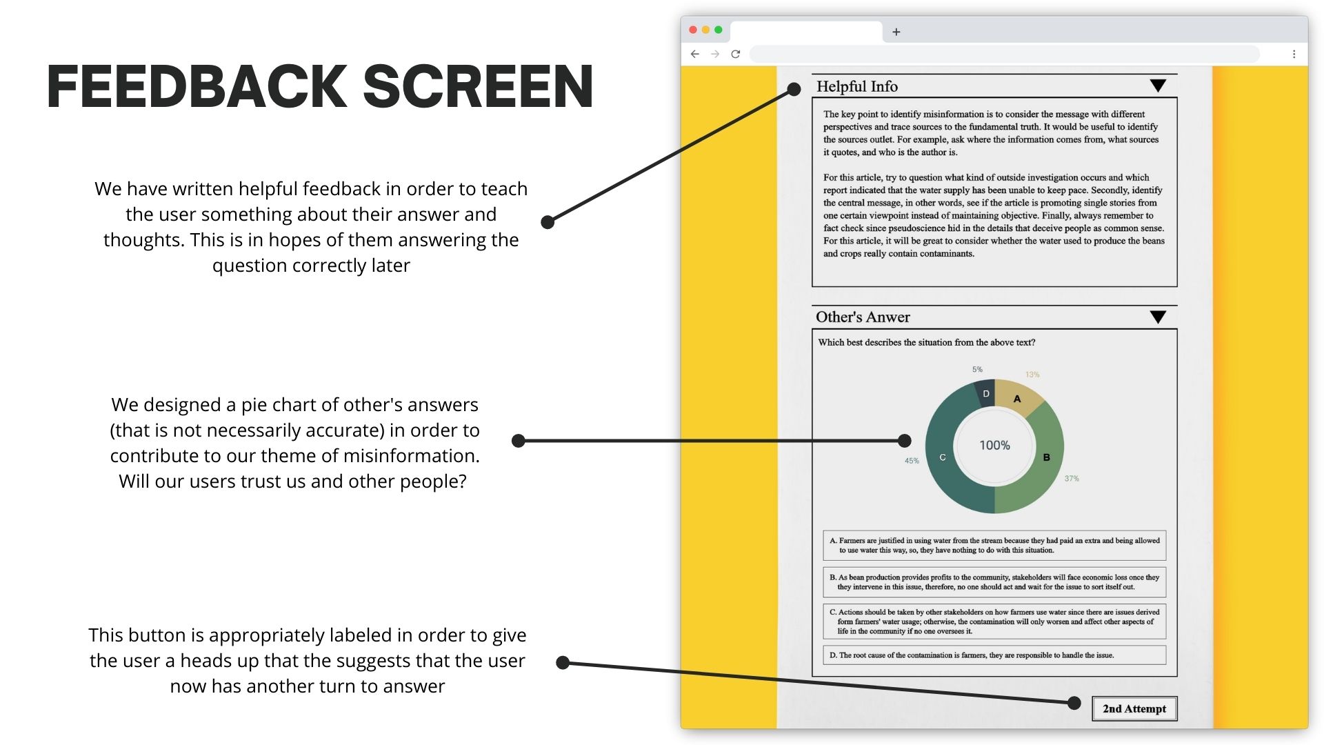
Additionally, it felt like our research was continuing through the late project iterations since we were focused on designing stories and scenarios for our prototype. We kept going back into answering questions like "How do we give feedback on answer choices," and "What scenarios incite bias and how do we keep that in mind."
Overall, as a team, we did our best to incorporate a flexible process that was understanding towards one another.
During research, we went in with an open mind since many of us were not familiar with the concept of transmedia, and only knew so much about misinformation. Here, our process was focused on our users, and we took them into high consideration when searching for the problem.
When we reflect on the lo fi prototypes, we had split up the work and each of us did one lo-fi prototype. In our reflection, we should have each come up with multiple designs and created many more mock ups.
Our evaluation was a point in our project where we were very un-invovled. Although we got helpful feedback on our design, much of it was out of frustration with our prototype, and if we were to do the project again, we would have solidified our evaluation process.
Reflecting on our hi-fi prototype, our process involved improving the overall design and incorporating the feedback from the evaluations rather than adding additional and needed features to our product. Our mentality started to become to finish the project rather than go back and make fundamental design changes.
During the beginning of our project, we had originally planned to focus on the spread of misinformation through social media. This was ethically inconsiderate because we were trying to design misinformation. This switch happened after our brainstorming feedback session.
We focused a lot of our efforts on designing our stories. Even though this was an interaction design project, we spent a lot of time on the content of our project (researching stories, providing feedback, etc) when we should have paid more attention to the interactions in our UI.
We had a difficult time with our team having two students in Asia, one on the West Coast and one on the East Coast. This affected times that we were able to meet and collaborate. This caused our work to be distributed (which caused disjointed work).
We would be interested in testing our design with users to see if their answers are affected by other people's results.
Additionally, we would be interested in incorporating more transmedia elements to our design; this could include programmed mini games, comic strips, and other digital media elements.
Practically, we would improve the design of NewsPixel. This would include updating our newspaper inspired design as well as experimenting with a wider variety of fonts and colors.